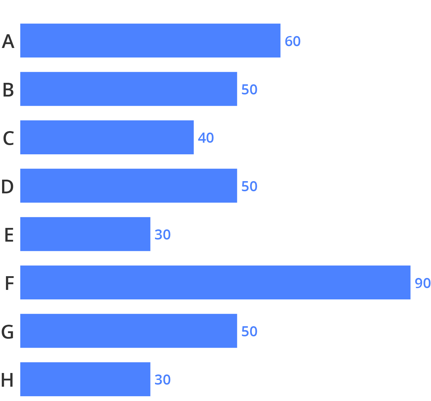
Grid lines can be used to allow the reader read the values represented by the bars from the numerical axis.

Source: Maarten Lambrechts, CC BY 4.0
A better option is to put the data values as labels at the end of the bars. In that way the readers have direct access to the actual data, without having to read them from the grid lines. When data labels are present, the grid lines can be left out, because the data values can be read directly from the chart.

Source: Maarten Lambrechts, CC BY 4.0
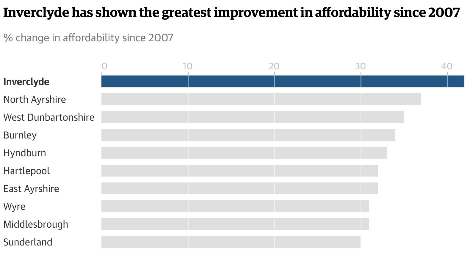
An “invisible grid” can be placed on top of the bars, which might make comparisons easier.

Source: The Guardian