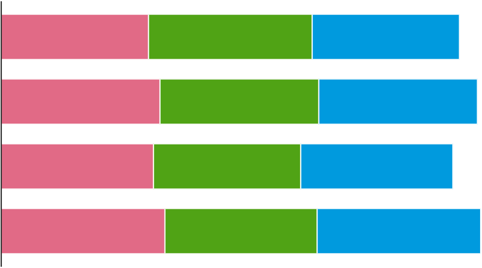
Stacked bar charts are great for showing how a total is broken down into subcategories. But stacked bars work less well when it is important to be able to compare the values within the stacked group of bars.
For example, try to identify the longest bar for each colour in the chart below.

Source: Maarten Lambrechts, CC BY SA 4.0
You will probably be able to tell which of the pink bars is the longest. But you will have a much harder time identifying the longest green and blue bar.
The reason why it is harder to find the longest bar in the green and blue bars is that the bars do not share a common baseline. All the green and blue bars start at a different x position, while the pink bars all share the same starting point. In the example above, the baseline for the green and blue bars has only shifted a little bit, in real life stacked bar charts, this shift can be much bigger, making comparisons even harder.
A rule of thumb for stacked bar charts is to only use them if the totals (the sum of all stacked bars) is more important than the individual series. If you want the reader to be able to easily compare values and see the trends easily for individual series, using another, non-stacked chart type is more appropriate. These could be line charts or small multiples, for example.
For reasons of accessibility, it is advised to use a visible outline between the bars in a stack, like the outline in the bar above. This improves the legibility, especially for people suffering from colour blindness.