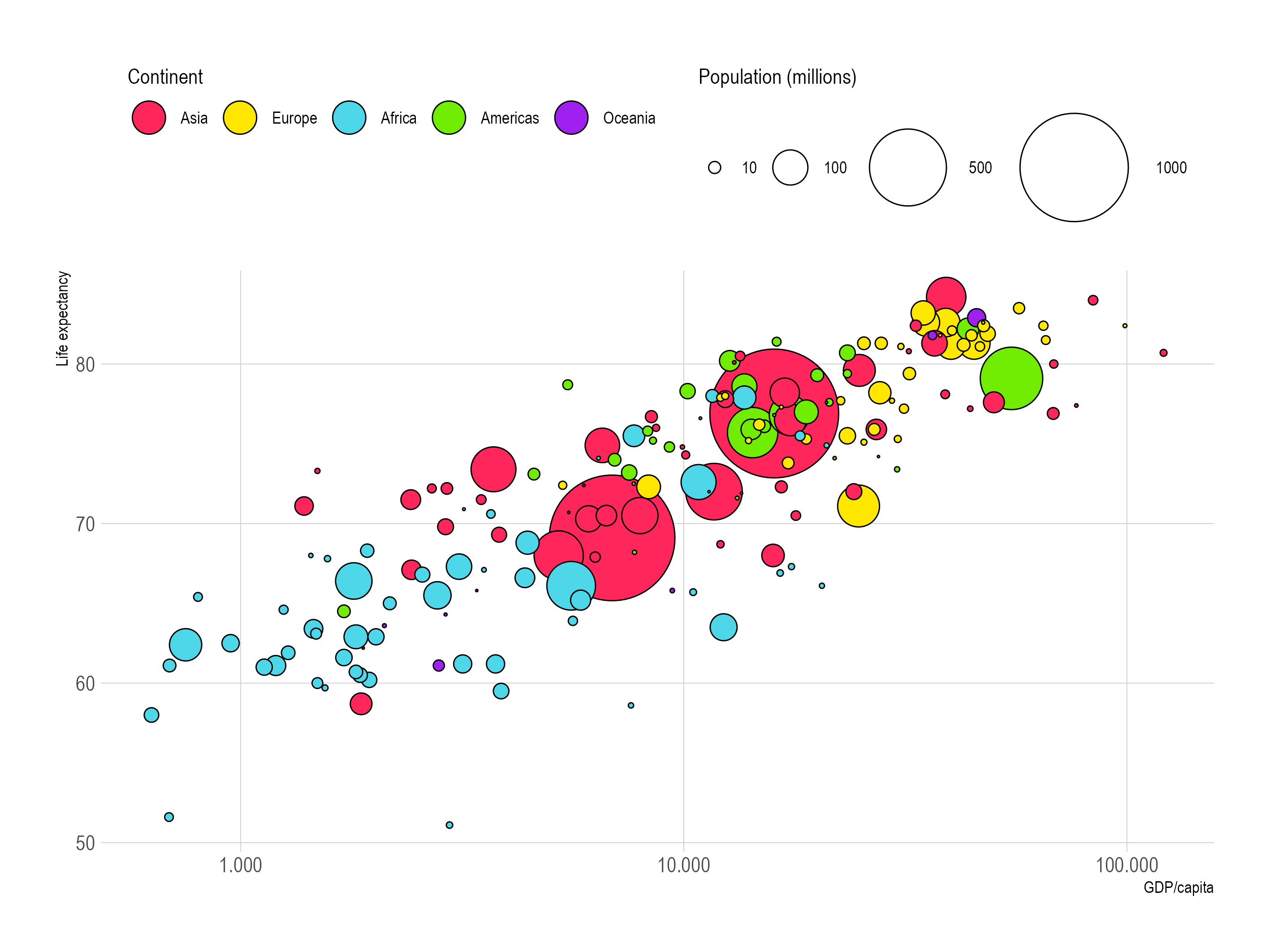
Consider the following plot:

Source: Maarten Lambrechts, CC BY SA 4.0
The Introduction to aeshtetics page discusses the x, y, shape, size, and fill colour aesthetics used in the point geometry in this chart. And even though the point geometry is a very simple one, and we are using humble circles as the shape, there are additional aesthetics available:
- the circles are fully opaque, but
opacityis also an aesthetic that can be used to map data to. On top of that, a different opacity could be applied to the fill and the stroke of the circles. - the circles have thin, black stroke applied to them. This stroke in itself can have multiple aesthetics:
- the
strokecolour - the
stroke width - the
stroke dash pattern
- the
- the circles have solid coloured fill, but they could also have a
fill pattern - in the chart, the smaller circles (which represent countries with small populations) are drawn on top of the bigger ones (countries with large population). So you could consider the population variable to be mapped to the order or
sortaesthetic
With some creativity, you could come up with even more aesthetics for shapes as simple as circles. But some aesthetics are more powerful and more effective than others, and the original chart is already using the most powerful ones. The other aesthetics could be used for double encoding (for example, giving the circles a stroke colour that is a darker shade of their fill colour) or for styling and readability reasons (for example, the circles could have a little transparency set to them to better display overlapping circles).
The original chart is also hitting the limits of the number of aesthetics readers can process. Using 4 or more aesthetics mapped to data should be done with caution.