Free, R package
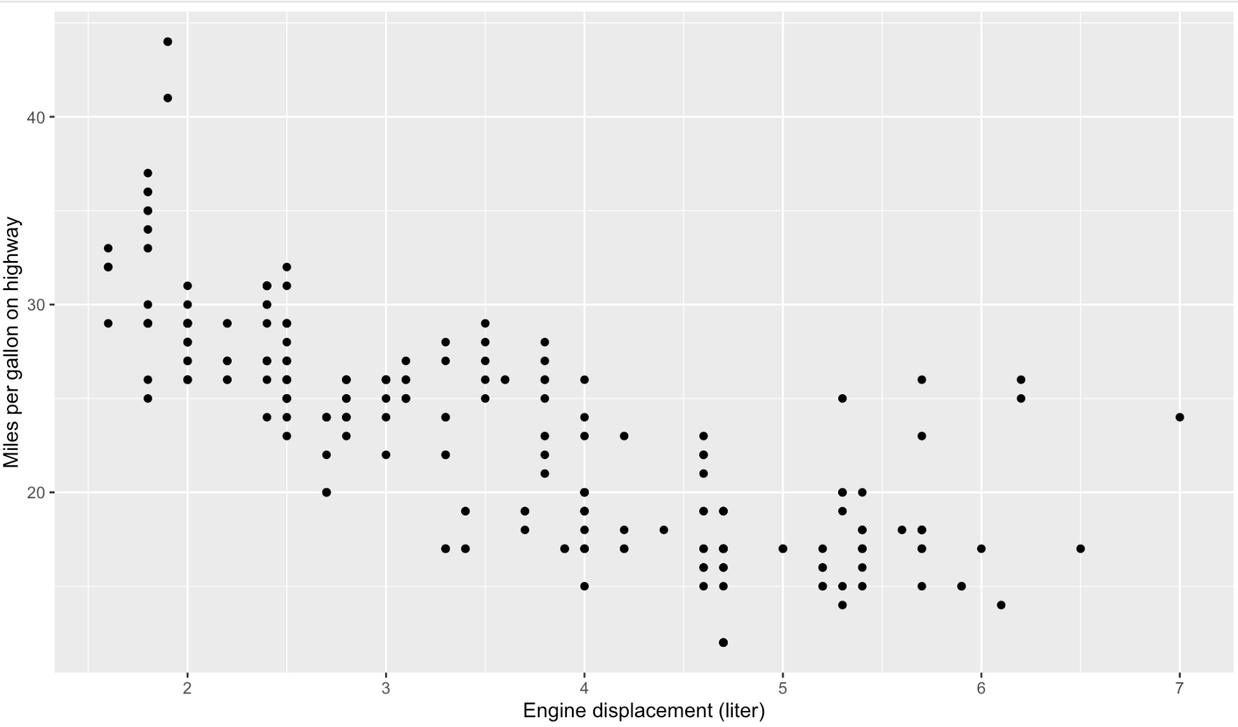
ggplot2 is a visualisation package for the R programming language. ggplot2 is not chart template based, which means that when you use ggplot2 to make a visualisation, you don’t choose a chart type in your code. Instead, with ggplot2 you can map columns in your data to the visual properties of geometric elements. For example, to create a scatter plot with ggplot2, you add circles to your visualisation, and you map numerical columns in your data to the x and y position of the circles.
library(ggplot2)

ggplot(data = mpg, aes(x = displ, y = hwy)) +
  geom_point() +
  xlab("Engine displacement (liter)") +
  ylab("Miles per gallon on highway")
Source: Maarten Lambrechts, CC-BY-SA 4.0
ggplot2 uses the output formats available in R to save its output, which includes both bitmaps (PNG, JPG) and vector files (SVG, PDF). The R-graph-gallery.com website displays many example visualisations, together with the ggplot2 code that generated them.
See Grammar of Graphics in practice: ggplot2 for an introduction to ggplot2.