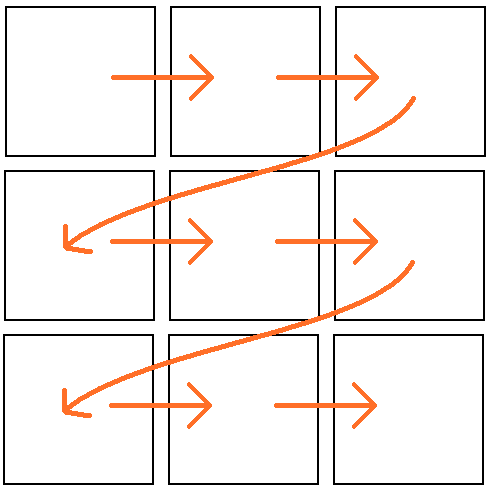
The simplest and easiest way to create visual hierarchy is choosing where to place elements in a design. Elements positioned at the top of a publication will be looked at before elements further down the page, and elements on the left of a line or row will be looked at before elements with the same visual weight positioned on the right (for readers with left to right languages, this is reversed for right to left languages).

Illustration of the reading order, Maplestrip, CC0
The hierarchy for the position of elements on a design is
top left > top right > bottom left > bottom right
The importance of the elements positioned at these locations should reflect this hierarchy/reading sequence.