Braille textbooks sometimes contain tactile graphics: embossed maps, charts, schematic diagrams and geometric figures that can be sensed through touch.
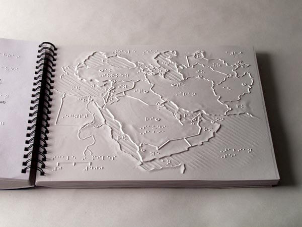
A tactile map of the Middle East. Source: aph.org
Tactile maps are important for wayfinding in public transport infrastructure for visually impaired people.
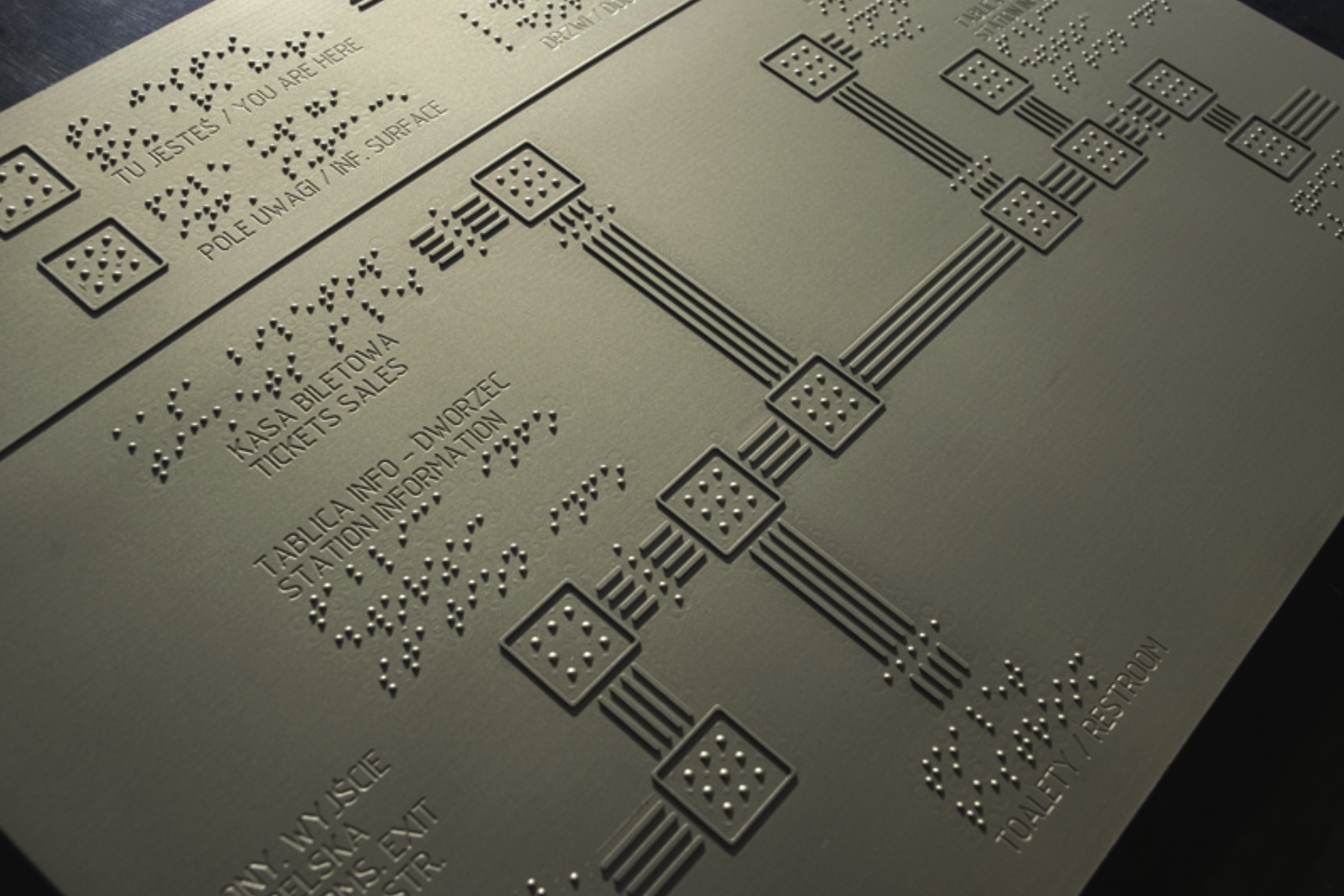
A tactile map of the Warsaw East station, Poland. Source: Tactile Graphics at Railway Stations – an Important Source of Information for Blind and Visually Impaired Travellers
Making tactile graphics is an art in itself, and usually involves manual craft. The American Printing House for the Blind has published a library of templates for good tactile designs, which also includes some examples of charts.
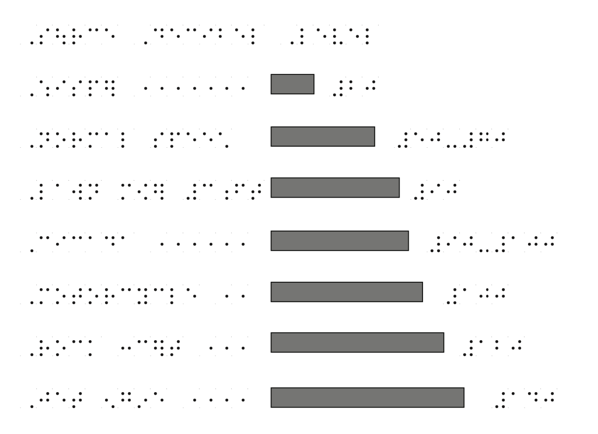
A tactile bar chart showing the loudness of different sounds in the decibel scale, from a whisper at the top to a jet engine at the bottom. Source: imagelibrary.aph.org
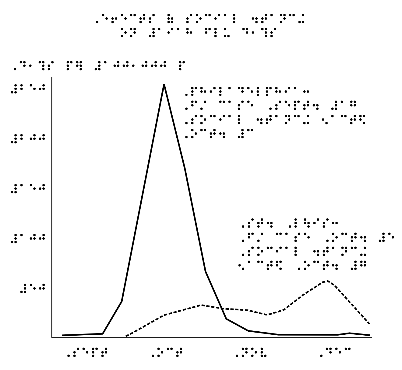
A tactile graph showing the effect of social distancing on the evolution of an infectious disease. Source: imagelibrary.aph.org
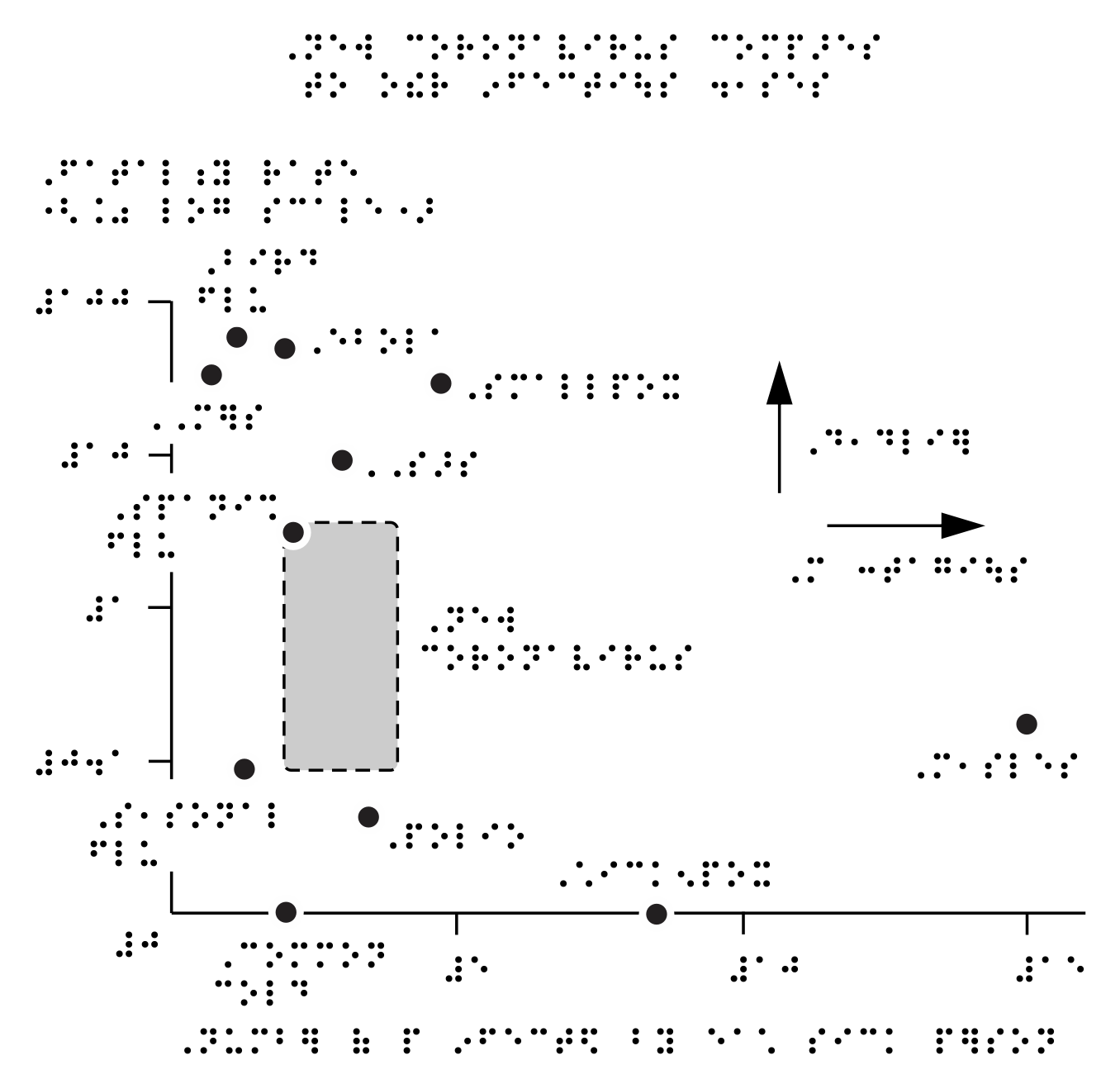
A tactile scatter plot showing the fatality rate (y axis) and contagiousness (x axis) of selected diseases, inspired by a chart by The New York Times. Source: imagelibrary.aph.org
An attempt to make time series data accessible on refreshable braille displays is SparkBraille. It uses the cells of the braille display to show a simplified version of a line chart, to get the gist of the trends in the data.
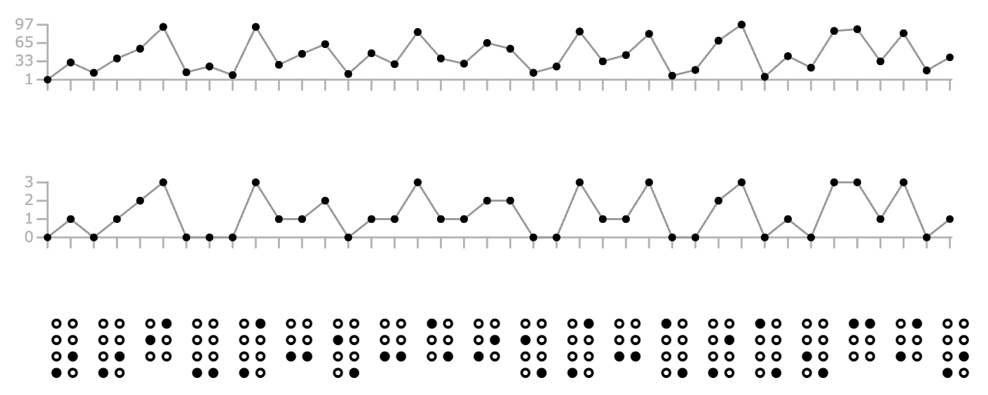
The numbers in the time series are binned into vertical buckets, and each braille cell is used to show 2 binned values. Source: fizzstudio.github.io/sparkbraille
SparkBraille is currently only a proof of concept.