SVG is a handy and convenient format for data visualisation. But it also has limitations: when a visualisation contains thousands of elements, performance becomes an issue, and your browser will start to hang. This is especially true if the elements in the visualisation are animated, which requires a lot of computing power.
In situations like this, where SVG is not an option, you can consider using the HTML <canvas> element. You can look at <canvas> as a bitmap image for which you compute the colour for each pixel dynamically with JavaScript. A deeper look at <canvas> would lead us too far, but below are some examples of visualisations that use it for data visualisation.
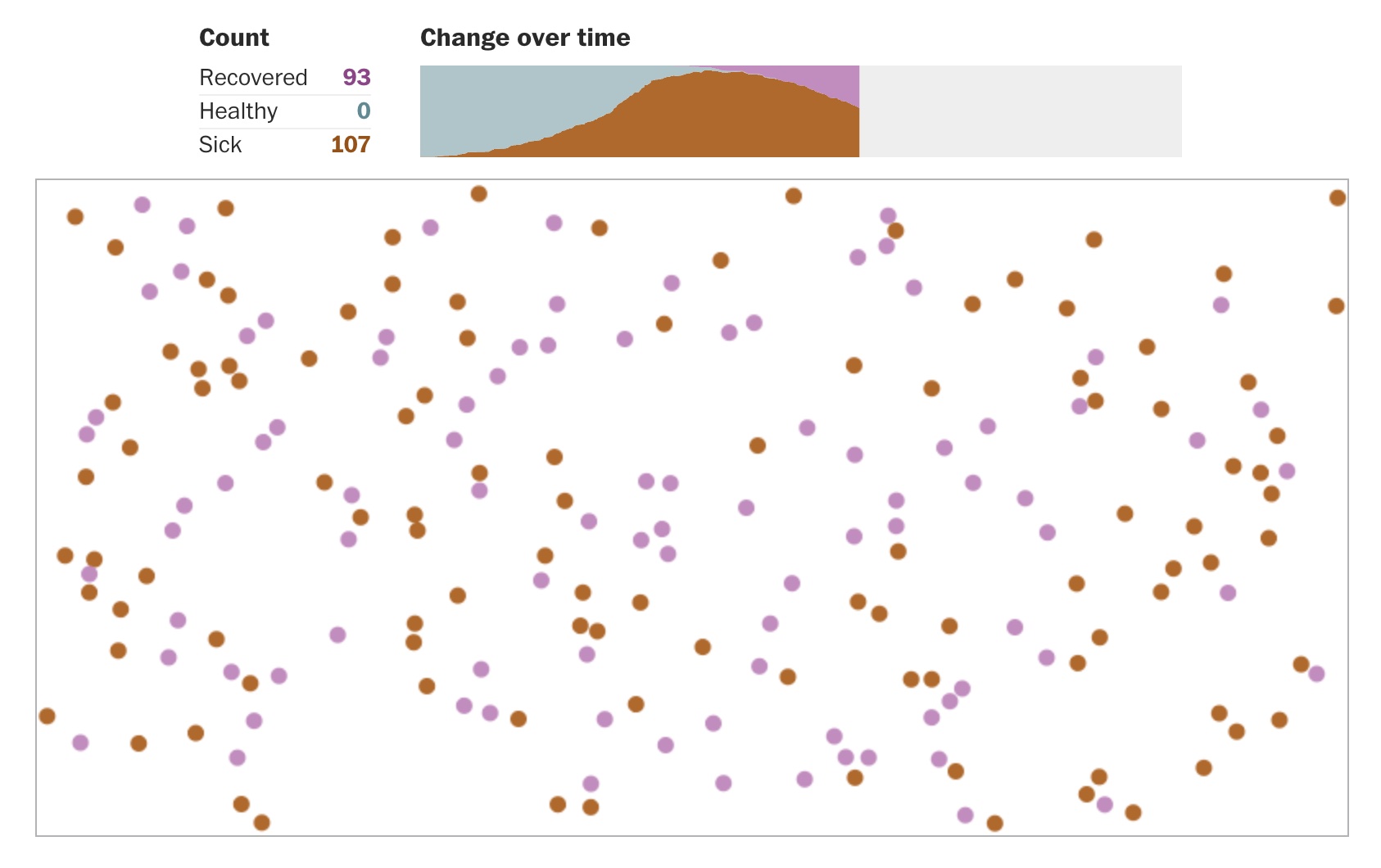
These simulations show how to flatten the coronavirus growth curve. Source: washingthonpost.com
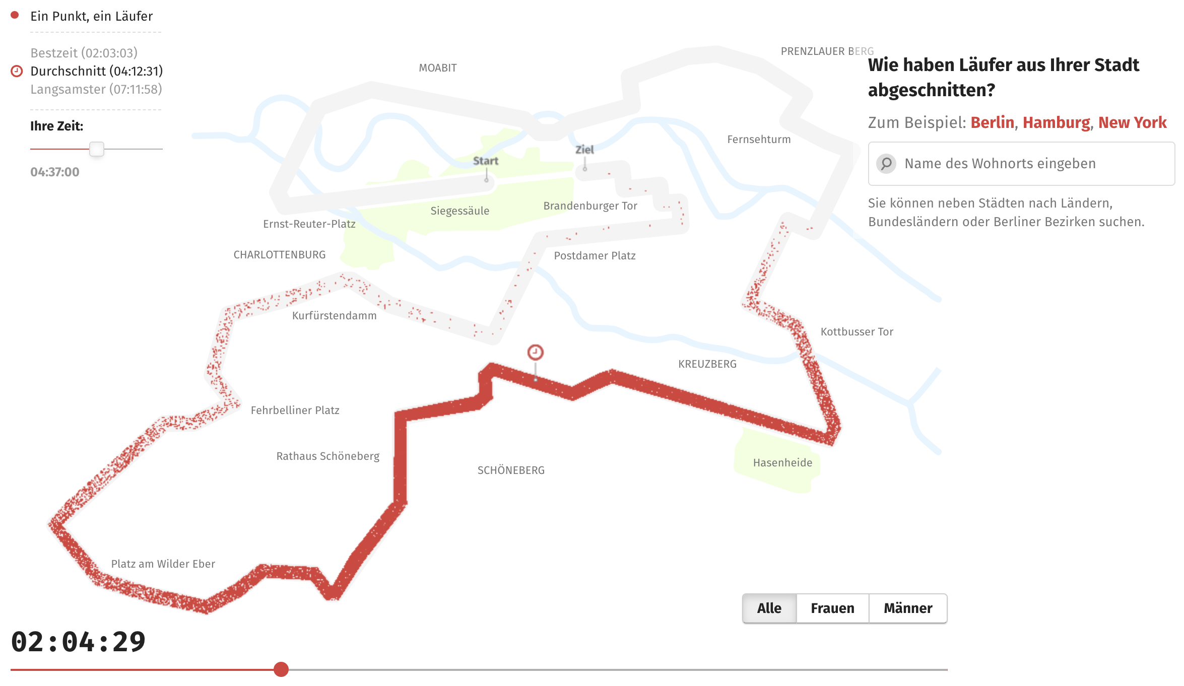
Source: Berlin-Marathon 2016 - So schnell läuft Ihre Stadt
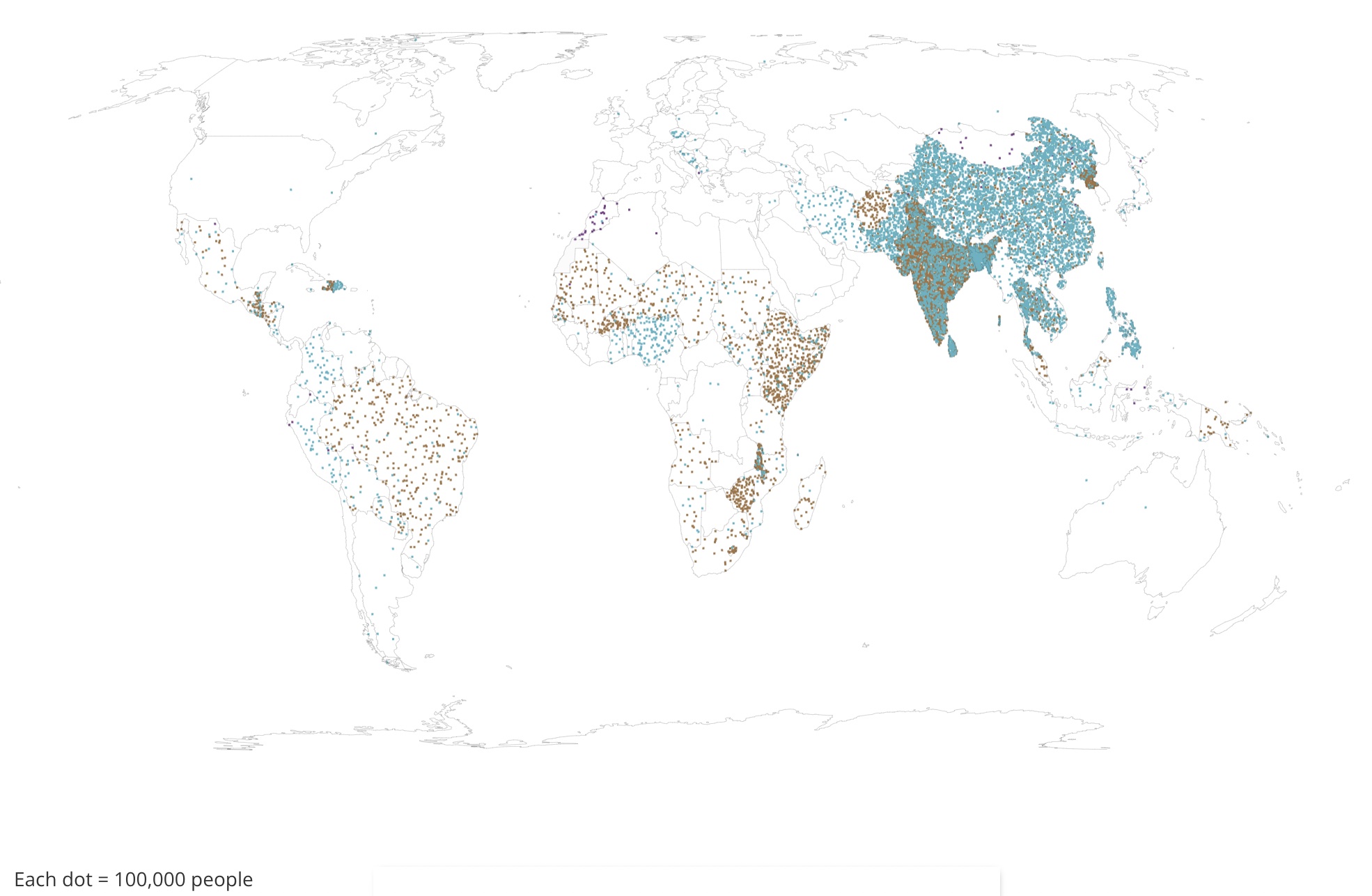
Source: SDG Atlas 2020