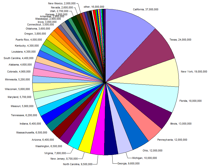
Pie charts have a bad name in data visualisation. Their bad reputation is partly due to many poorly designed pie charts being published, and suboptimal default settings in popular tools for data visualisation like Excel.
Source: Wikimedia, public domain
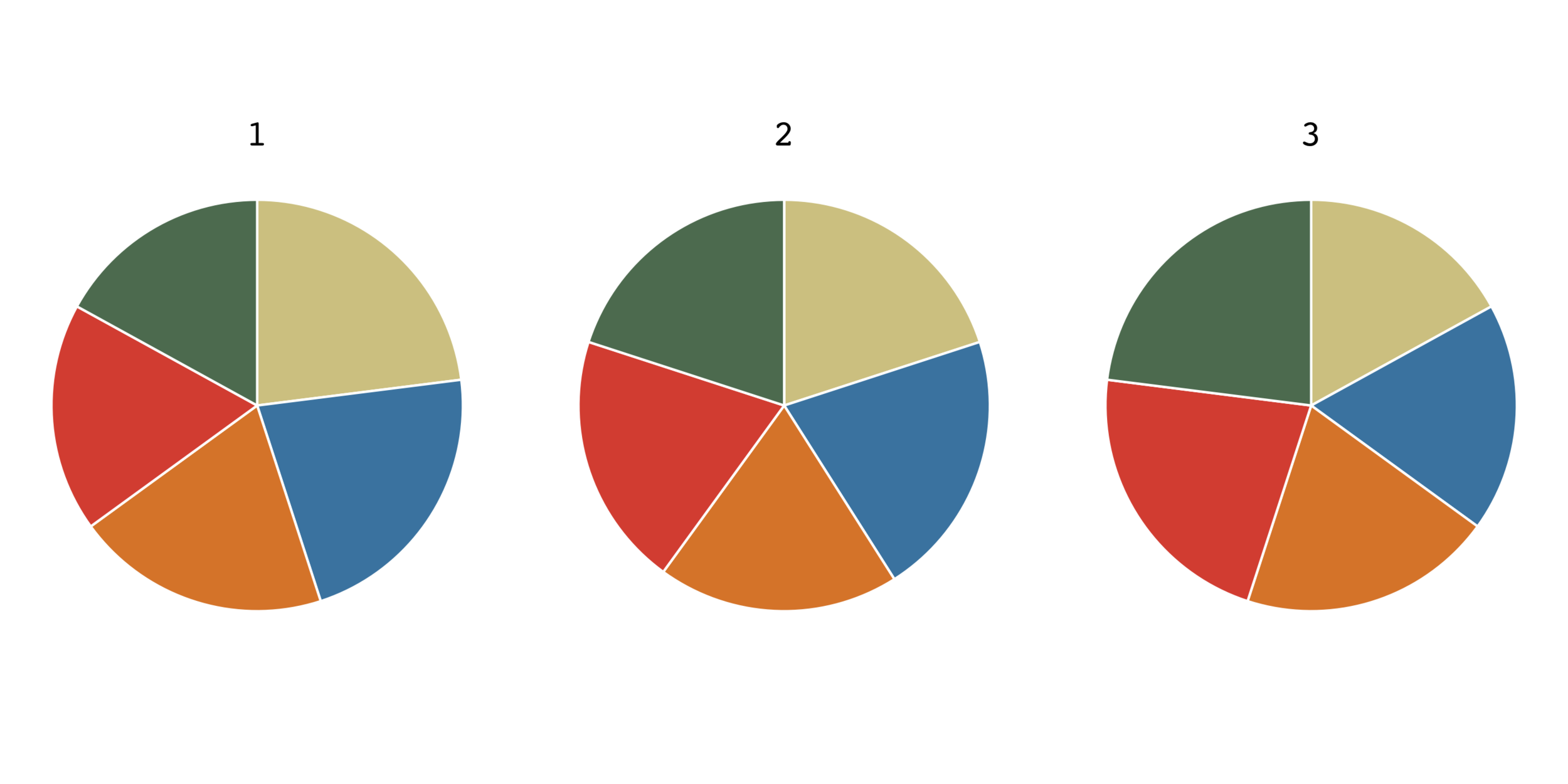
But there is no doubt that other chart types can be more effective, as the following example shows. In these 3 pie charts, there is always a smallest and a biggest slice of the pie. In pie charts 1 (left) and 3 (right) all slices have a different size. Can you identify the biggest and smallest slice in each pie?
Maarten Lambrechts, CC BY SA 4.0
So pie charts are not very effective if you want your audience to be able to assess proportions effectively. So under what circumstances are pie charts appropriate, and how can you improve their design? Here are some guidelines.
Pie charts are used to show how a total is composed out of its parts. So the parts of the pie should always add up to 100 percent.
Pies with more than 5 slices become harder to read. To limit the number of slices, you can group the smaller slices together in an “other” category.
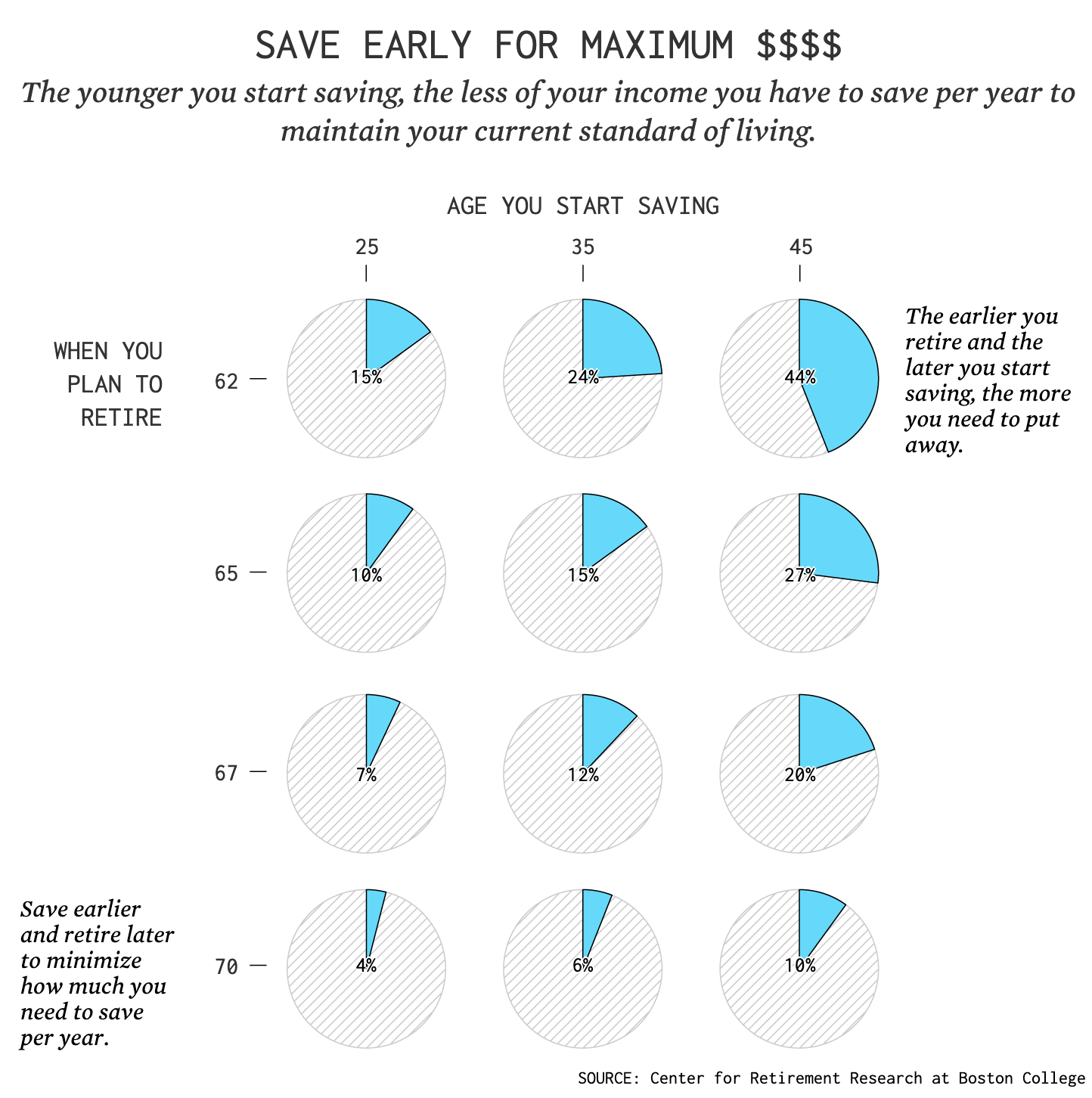
Highlighting the most important slice of a pie can work well.
Source: How Much You Should Be Saving for Retirement, flowingdata.com
In the design of the pie, sort the values, start the slices at 12 o’clock and try to avoid a separate colour legend and use direct labelling to name each slice.
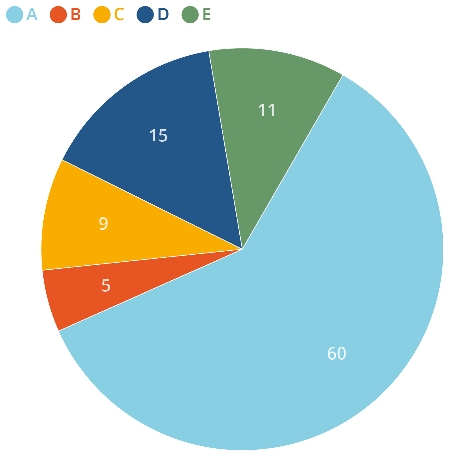
An unsorted pie chart with a separate colour legend, not starting at 12 o’clock. Source: Maarten Lambrechts, CC BY SA 4.0
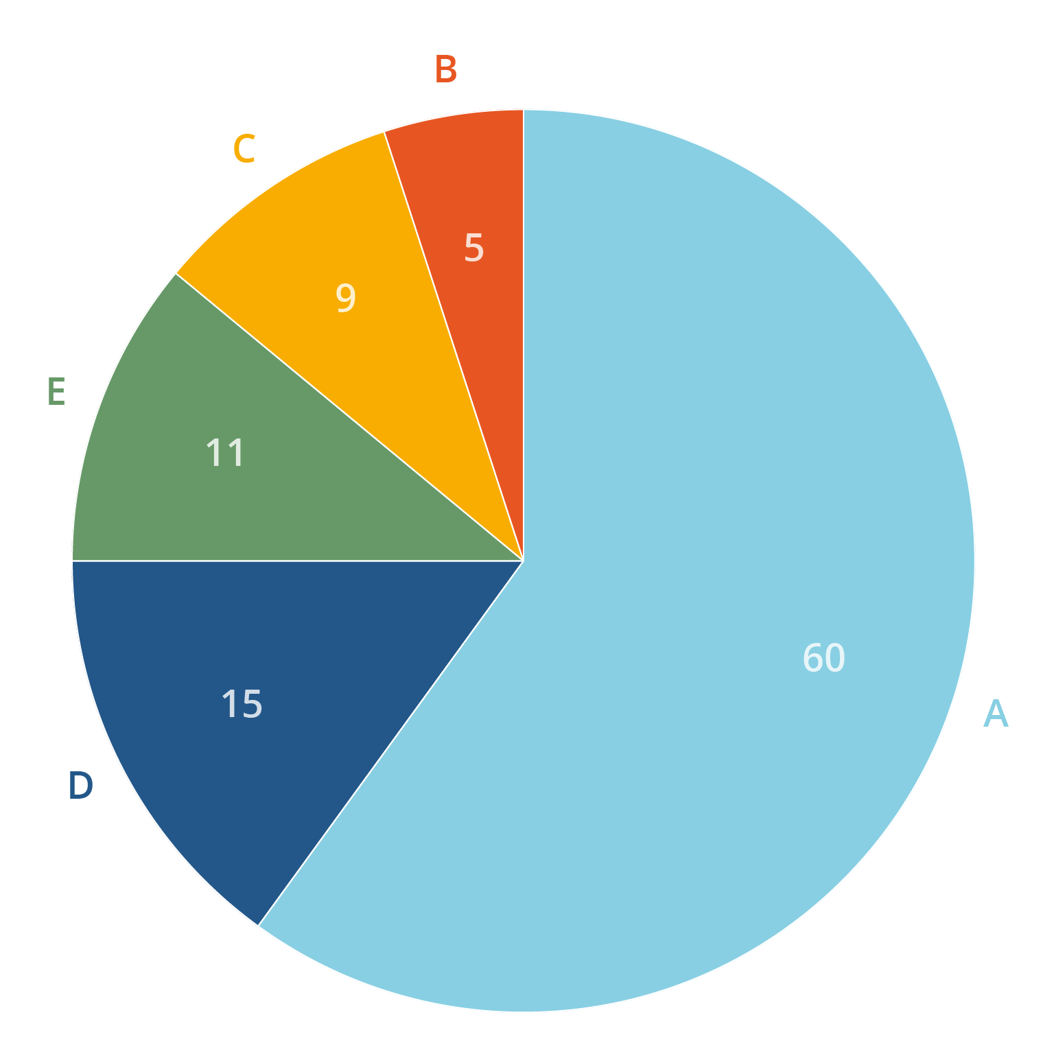
A sorted pie chart using direct labelling and starting at 12 o’clock. Source: Maarten Lambrechts, CC BY SA 4.0
The best use case for pie charts is when you want to show that the sum of a couple of the slices of the pie represent more than 50% (or 25 or 75%) of the total. In that case a pie chart can really shine and outperform other chart types.
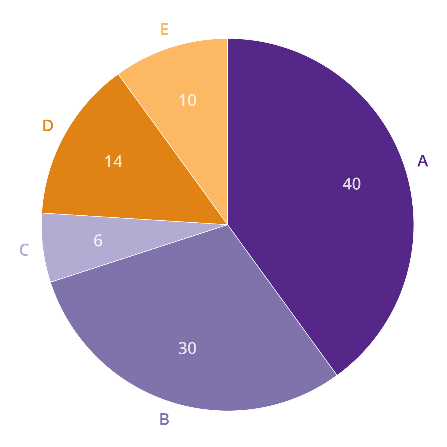
The purple slices in this pie total just over 75 percent. Source: Maarten Lambrechts, CC BY SA 4.0